
Scope
Brand design, strategy, website design, app design, collateral, naming, corporate identity, UI design, illustration, creative direction
Invert empowers enterprises and individuals to establish impactful, enduring connections with our climate, enabling them to actively reduce and offset carbon emissions.
When Invert approached me to create a name and develop their brand, they emphasized the importance of embodying key qualities: being a challenger in the field, maintaining an approachable and memorable presence. It was essential to keep in mind that their primary product would be an app, ensuring that the brand identity translated seamlessly into this digital platform.

When designing the logo, the name itself played a significant role in shaping the approach. Invert, with its mission to combat climate change and drive positive environmental impact by inspiring others to achieve net-zero emissions through CO2 removal, seeks to challenge conventional thinking and transform our daily routines into mindful actions. Embracing the literal meaning of "invert" as "to turn upside down or in the opposite direction," this concept guided the creation of the brand identity.
The icon shape draws inspiration from the ‘i’ found in the name and the familiar app buttons found on mobile screens, reflecting the tech-forward aspect of the brand. It serves as a visual representation of the commitment to merging environmental consciousness with technological innovation.
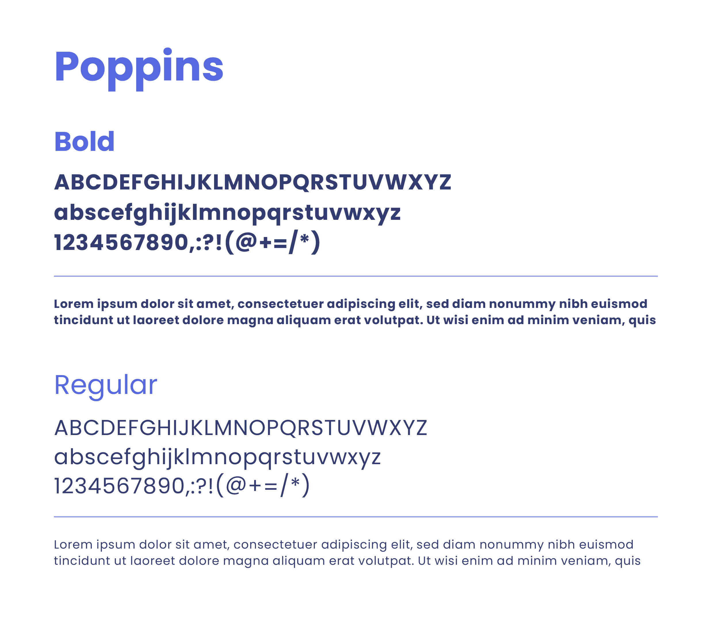

I carefully curated a clean, approachable, and tech-savvy color palette for the brand. In a crowded and competitive landscape, these colors were intentionally chosen to be distinct and uncommon, ensuring that our brand stands out from the crowd. The foundation of the palette is a clean and simple combination of purple and white. To enhance contrast, support visual hierarchy, and bring vibrancy to our illustrations, I added carefully selected accent colours. And as a climate action brand, it was essential to include a touch of green, symbolizing our commitment to environmental stewardship.


Drawing inspiration from the shapes within the logo, I created a cohesive system of patterns to be applied across both digital and print materials. These patterns not only complement the brand identity but also add visual interest and depth to the collateral. Careful consideration was given to negative space, ensuring that the overall design feels clean, uncluttered, and avoids overwhelming the viewer.


During the design process of the app, I placed great importance on aligning with the brand guidelines. The focus encompassed several key aspects, including cleanliness, ease of use, engagement, and visual appeal. I meticulously considered each of these elements to ensure a seamless and intuitive user experience, while also incorporating captivating illustrations and maintaining a visually appealing interface.

